Shop Now
-
ACRYLIC PAINTS & MEDIUMS
- Specials
- New Arrivals
- Featured
- Clearance
- ART SPECTRUM ACRYLIC MEDIUMS
- ART SPECTRUM COLOURFIX PRIMER
- ATELIER MEDIUMS
- AUREUO ACRYLIC PAINT SETS
- CHROMACRYL MEDIUMS
- CHROMACRYL STUDENT ACRYLIC
- DERIVAN MEDIUMS
- DERIVAN STUDENT ACRYLIC PAINT
- FLASHE
- FLUID WRITER PENS
- GOLDEN FLUID ACRYLIC
- GOLDEN HEAVY BODY ACRYLIC
- GOLDEN HIGH FLOW ACRYLIC
- GOLDEN MEDIUMS & VARNISHES
- GOLDEN OPEN ACRYLIC
- GOLDEN SOFLAT MATTE ACRYLIC
- MATISSE BACKGROUND
- MATISSE MEDIUMS
- MATISSE STRUCTURE
- NAM VARNISHES
- PEBEO ACRYLIC MEDIUMS
- PEBEO ORIGIN ACRYLIC
- PEBEO STUDIO ACRYLIC
- SCHMINCKE ACRYLIC MEDIUMS
- SCHMINCKE AEROCOLOR ACRYLIC
- SCHMINCKE AKADEMIE ACRYLIC
- SCHMINCKE PRIMACRYL PROFESSIONAL ACRYLIC
- WINSOR & NEWTON ACRYLIC MEDIUMS
- WINSOR & NEWTON ARTISTS ACRYLIC
- AIRBRUSHES
- ART ACCESSORIES
- ART BAGS, PORTFOLIOS & PRESENTATION
- BOARD & CARD
-
BOOKS
- New Arrivals
- BOOKS ACRYLIC PAINTING
- BOOKS ARCHITECTURE
- BOOKS ART AND CRAFT KITS
- BOOKS CHARACTER DESIGN
- BOOKS COLOUR THEORY
- BOOKS COLOURING BOOKS
- BOOKS CREATIVE KIDS
- BOOKS DRAWING
- BOOKS FASHION & TEXTILES
- BOOKS FIGURE DRAWING
- BOOKS FLORA AND FAUNA
- BOOKS GRAPHIC DESIGN
- BOOKS HAND LETTERING
- BOOKS ILLUSTRATION
- BOOKS KAWAII
- BOOKS LOGO DESIGN
- BOOKS MANGA
- BOOKS MIXED MEDIA
- BOOKS MONOGRAPHS
- BOOKS MOTIVATIONAL
- BOOKS NZ AOTEAROA ART
- BOOKS OIL PAINTING
- BOOKS ORIGAMI
- BOOKS PACKAGING DESIGN
- BOOKS PAPER ARTS
- BOOKS PHOTO TECHNIQUES
- BOOKS PHOTOGRAPHY
- BOOKS PRINTMAKING
- BOOKS PRODUCT DESIGN
- BOOKS PUZZLES AND GAMES
- BOOKS SCULPTURE AND CLAY
- BOOKS STREET ART
- BOOKS TYPOGRAPHY
- BOOKS URBAN SKETCHING
- BOOKS WATERCOLOUR PAINTING
-
BRUSHES & PALETTE KNIVES
- Specials
- New Arrivals
- Clearance
- BAMBOO BRUSHES
- BRUSH SOAP & CLEANERS
- BRUSH STANDS & STORAGE
- COLOUR SHAPERS
- DA VINCI BLACK SABLE BRUSHES
- DA VINCI BRISTLE BRUSHES
- DA VINCI BRUSH SETS
-
DA VINCI CASANEO WATERCOLOUR BRUSH
- DA VINCI CASANEO FLAT BRUSH
- DA VINCI CASANEO LINER BRUSH
- DA VINCI CASANEO MINI BRUSHES
- DA VINCI CASANEO MOTTLER
- DA VINCI CASANEO OVAL BRUSH
- DA VINCI CASANEO POCKET TRAVEL BRUSH
- DA VINCI CASANEO RIGGER BRUSH
- DA VINCI CASANEO ROUND BRUSH
- DA VINCI CASANEO SHORT STROKE BRUSH
- DA VINCI CASANEO SLANT EDGE BRUSH
- DA VINCI CASANEO WASH BRUSH
- DA VINCI CHUNEO SYNTHETIC BRISTLE BRUSHES
- DA VINCI COLINEO OIL & ACRYLIC LONG HANDLED BRUSHES
-
DA VINCI COLINEO WATERCOLOUR BRUSHES
- DA VINCI COLINEO WATERCOLOUR BRUSH FAN
- DA VINCI COLINEO WATERCOLOUR BRUSH FLAT
- DA VINCI COLINEO WATERCOLOUR BRUSH RETOUCHING
- DA VINCI COLINEO WATERCOLOUR BRUSH RIGGER
- DA VINCI COLINEO WATERCOLOUR BRUSH ROUND
- DA VINCI COLINEO WATERCOLOUR BRUSH SLANTED
- DA VINCI COLINEO WATERCOLOUR BRUSH WASH
- DA VINCI COLINEO WATERCOLOUR BRUSH X POINT
- DA VINCI COSMOTOP MIX BRUSHES
- DA VINCI COSMOTOP NOVA BRUSHES
- DA VINCI COSMOTOP SPIN BRUSHES
- DA VINCI COSMOTOP WASH BRUSHES
- DA VINCI DRY BRUSHES SYNTHETIC
- DA VINCI FORTE BRUSHES
- DA VINCI IMPASTO BRUSHES
- DA VINCI JUNIOR SYNTHETIC BRUSHES
- DA VINCI KOLINSKY RED SABLE BRUSHES
- DA VINCI LETTERING BRUSHES
- DA VINCI MAESTRO2 BRISTLE BRUSHES
- DA VINCI MICRO BRUSHES
- DA VINCI PADDLE BRUSHES
- DA VINCI SPECIAL BRUSHES
- DA VINCI SQUIRREL/WASH BRUSHES
-
DA VINCI STUDENT BRUSHES
- DA VINCI COLLEGE BRUSH FILBERT
- DA VINCI COLLEGE BRUSH FLAT
- DA VINCI COLLEGE BRUSH ROUND
- DA VINCI FIT HOBBY BRUSH FILBERT
- DA VINCI FIT HOBBY BRUSH FLAT
- DA VINCI FIT HOBBY BRUSH ROUND
- DA VINCI FIT HOBBY SYNTHETIC MOTTLER BRUSH
- DA VINCI FIT SYNTHETIC BRISTLE BRUSH FLAT
- DA VINCI FIT SYNTHETIC BRISTLE BRUSH ROUND
- DA VINCI STUDENT BRISTLE ROUND
- DA VINCI TOP-ACRYL BRUSHES
- ESSDEE SPONGE ROLLERS
- EXPRESSION BRUSHES
- JASART 577 ETERNA BRUSH
- JASART HOG BRISTLE BRUSHES
- JASART MOP & STENCIL BRUSHES
- PALETTE KNIVES
- PEBEO BRUSH SETS
- PEBEO IRIS BRUSHES
- PEBEO MOTTLER BRUSHES
- WINSOR & NEWTON COTMAN WATERCOLOUR BRUSHES
- WINSOR & NEWTON GALERIA BRUSHES
- WINSOR & NEWTON SCEPTRE GOLD BRUSHES
- WINSOR & NEWTON SERIES 7 BRUSHES
- WINSOR & NEWTON WINTON BRUSHES
-
CANVAS & PANELS
- Specials
- New Arrivals
- Featured
- Clearance
- CANVAS ROLLS
- CANVAS STRETCHING TOOLS
- CEDAR STRETCHER BARS
- EXPRESSION CANVAS PANELS
- EXPRESSION CRADLED GESSO BOARDS
- EXPRESSION FLOATING CANVAS FRAMED
- EXPRESSION STRETCHED CANVAS
- FREDRIX STRETCHED CANVAS, PANELS, PADS
- MUSEO LINEN CANVAS
- MUSEUM STRETCHED CANVAS
- NAM NATURAL LINEN CANVAS
- NAM ROUND CANVAS PANELS
- PINE STRETCHER BARS & BRACES
- PRO-PANELS
- SKATEBOARD DECK ART BOARD
- STRETCHED WITH LOVE CANVAS
- CERAMIC PAINT
- DRAWING BOARDS,STANDS & TABLES
- EASELS
- ENCAUSTIC PAINTS & MEDIUMS
- ENVELOPES
- FABRIC PAINT, DYES & ACCESSORIES
- FACE & BODY PAINT
- FOAMBOARD
- GIFT CARDS
- GLASS PAINT
- GOUACHE PAINTS
- INKS
-
KNIVES & CUTTING TOOLS
- Specials
- New Arrivals
- Clearance
- DAFA CUTTING TOOLS
- DAFA RULERS
- DESIGN PEN KNIFE
- EXCEL KNIVES & CARVING TOOLS
- EXPRESSION CUTTING MATS
- FISKARS CUTTING TOOLS
- LEDAH TRIMMERS & GUILLOTINES
- LOGAN CUTTING & FRAMING TOOLS
- REVOLVING LEATHER PUNCH
- SCISSORS
- SNAP BLADE KNIVES & BLADES
- SWANN MORTON SCALPEL KNIVES & BLADES
- LIGHT PADS, LIGHTBOXES & LIGHTING
-
MARKERS & PENS
- Specials
- New Arrivals
- Featured
- Clearance
- ARTLINE PENS
- AUREUO ALCOHOL TWIN TIP MARKER SETS
- CALLIGRAPHY PENS & NIBS
- CLASS PACKS MARKERS & PENS
- COPIC CIAO MARKERS
- COPIC CLASSIC MARKERS
- COPIC GASENFUDE BRUSH PENS
- COPIC MULTI LINERS
- COPIC REFILL INKS
- COPIC SKETCH MARKERS
- CORRECTION TAPES & PENS
- FABER CASTELL ALBRECHT DURER WATERCOLOUR MARKERS
- FABER CASTELL BLACK EDITION SHAKE & PAINT MARKER
- FABER CASTELL CONNECTOR PEN SETS
- FABER CASTELL GRIP PLUS BALL PENS
- FABER CASTELL PITT ARTIST DUAL MARKER
- FABER CASTELL PITT ARTIST PENS
- HAHNEMUHLE ROLLERBALL PENS
- ICON PENS & MARKERS
- INDIGRAPH FOUNTAIN PENS
- LAMY LIMITED EDITION PENS
- LAMY PENS
- LEUCHTTURM 1917 DREHGRIFFEL BALLPOINT PENS
- MARKER WALLETS & STORAGE
- MOLOTOW BLACKLINER PIGMENT LINER PENS
- MOLOTOW BURNER MARKERS
- MOLOTOW CHALK MARKERS - REFILLABLE
- MOLOTOW DRIPSTICKS
- MOLOTOW EXCHANGE TIPS
- MOLOTOW GRAFX MASKING LIQUID
- MOLOTOW LIQUID CHROME MARKERS
- MOLOTOW MASTERPIECE PAINT MARKERS
- MOLOTOW ONE4ALL PAINT MARKERS
- MOLOTOW SKETCHER MARKERS
- PEBEO 4ARTIST OIL BASED PAINT MARKERS
- PEBEO COLOREX WATERCOLOUR INK MARKERS
- PENTEL PENS
- PILOT MR SERIES PENS
- PILOT PENS
- POSCA MARKERS
- ROTRING PENS
- SCHMINCKE AERO LINER EMPTY MARKERS
- SCHNEIDER
- SHARPIE
- SHARPIE CREATIVE MARKER SETS
- STAEDTLER COLOUR FIBRE TIP PEN
- STAEDTLER DESIGN JOURNEY MARKER SETS
- STAEDTLER LUMOCOLOR MARKERS
- STAEDTLER MARS MATIC TECH PENS
- STAEDTLER PIGMENT ARTS PEN
- STAEDTLER PIGMENT LINER
- STAEDTLER TEXTSURFER HIGHLIGHTERS
- STAEDTLER TRIPLUS FINELINERS
- STAEDTLER WRITING PENS
- TEXTA LIQUID CHALK MARKERS
- TOMBOW DUAL BRUSH PENS
- TOMBOW FUDENOSUKE PENS
- U-KNOCK XQ GEL PEN
- UNI PENS & MARKERS
- WINSOR & NEWTON BRUSH MARKERS
- WINSOR & NEWTON PROMARKERS
- ZIG PENS
-
MODELLING , SCULPTING, CLAY & RESIN
- Specials
- New Arrivals
- Clearance
- 3D PRINTING FILAMENT
- BALSA & BASSWOOD
- CHAVANT MODELLING CLAY
- CLAY SHAPERS
- CLAYTOON NON-HARDENING MODELLING CLAY
- DAS MODELLING CLAY
- ESSDEE ALUMINIUM ROLLERS
- EXCEL MODELLING TOOLS
- EXPRESSION MODELLING TOOLS
- FIMO
- FIMO AIR-DRY MODELLING CLAY
- FIMO EFFECT
- FIMO KIDS
- FIMO LEATHER-EFFECT
- FIMO PROFESSIONAL
- FIMO TOOLS & ACCESSORIES
- GEDEO CLAY, RESIN & MOULDING
- HOT WIRE FOAM TOOLS
- JOVI AIR HARDENING CLAY
- K&S METALS
- KIWI UNDERGLAZE
- MACS MUD CLAYS
- MDF BOARD & PLYWOOD PANELS
- MILLIPUT EPOXY PUTTY
- MISCELLANEOUS MODELLING TOOLS
- MODELLING COMPOUNDS & PLASTER
- MODELLING WIRE
- NORSKI RESINS & ACCESSORIES
- PAL TIYA PREMIUM
- PEBEO FLUID PIGMENTS FOR RESINS
- PLASTALINA NON-HARDENING MODELLING CLAY
- PLASTIC SHEET PRODUCTS
- POP STICKS
- PROTOLINA NON-HARDENING MODELLING CLAY
- RGM SCULPTING TOOLS
- SCULPEY CLAYS
- SCULPEY LIQUID BAKEABLE CLAY
- SCULPEY PREMO CLAY
- SCULPEY SOUFFLE CLAY
- SCULPEY TOOLS & ACCESSORIES
- SCULPEY ULTIMATE DIY KITS
- WOODEN SHEETS & STICKS
-
OIL PAINTS & MEDIUMS
- Specials
- New Arrivals
- Clearance
- ART SPECTRUM ARTIST OILS
- ART SPECTRUM OIL MEDIUMS
- CHROMA ARCHIVAL OIL MEDIUMS
- EXPRESSION WATERSOLUBLE OIL STICKS
- FIVE STAR OIL MEDIUMS
- GAMBLIN MEDIUMS
- MAIMERI CLASSICO OIL
- MICHAEL HARDING OILS
- OLD HOLLAND OIL COLOURS
- PEBEO OIL MEDIUMS
- PEBEO XL OIL
- R&F PIGMENT OIL PAINT STICKS
- SCHMINCKE ARTIST OIL FLAKE WHITE
- SCHMINCKE MUSSINI OIL
- SCHMINCKE NORMA BLUE WATER-MIXABLE OIL
- SCHMINCKE NORMA PROFESSIONAL OIL
- SCHMINCKE OIL MEDIUMS
- SHELLAC
- TMK SOLVENTS & SPIRITS
- WILLIAMSBURG OIL
- WINSOR & NEWTON ARTISAN WATER MIXABLE OILS
- WINSOR & NEWTON ARTISTS OILS
- WINSOR & NEWTON GRIFFIN ALKYD FAST DRYING OIL COLOUR
- WINSOR & NEWTON OIL MEDIUMS
- WINSOR & NEWTON WINTON OILS
- PACKAGING PRODUCTS
-
PADS, BLOCKS & PACKS
- Specials
- New Arrivals
- Clearance
- ARCHES PADS & BLOCKS
- AWAGAMI WASHI PACKS
- BOCKINGFORD PADS
- CANSON PADS & BLOCKS
- CLAIREFONTAINE PASTELMAT PADS
- COLOURFIX PADS & PACKS
- FABRIANO PADS, PACKS & BLOCKS
- GORDON HARRIS PADS
- GRAPH PAPER PADS & SHEETS
- HAHNEMUHLE PADS, PACKS AND BLOCKS
- LANA FINE ART PAPER PADS & PACKS
- MAGNANI BLOCKS & PADS
- MOLOTOW MARKER PADS
- WARWICK EXERCISE BOOKS & PADS
- WINSOR & NEWTON MARKER PADS
- X-PRESS IT BLENDING PADS
- PANTONE GUIDES
- PAPER & CARD COLOURED
- PAPER ACCESSORIES
-
PAPER FINE ART
- Specials
- New Arrivals
- ARCHES FINE ART PAPERS
- AWAGAMI FINE ART PAPERS
- CANSON MI-TEINTES PAPER
- CANSON WATERCOLOUR PAPERS
- CARTRIDGE PAPER
- COLOURFIX PAPER
- EXPRESSION RENDERING PAPER
- FABRIANO FINE ART PAPERS
- FABRIANO TIZIANO DRAWING PAPER
- GLASSINE PAPER
- HAHNEMUHLE FINE ART PAPER - ROLLS
- HAHNEMUHLE FINE ART PAPER - SHEETS
- KHADI PRINTMAKING PAPER
- LANA FINE ART PAPERS
- MAGNANI FINE ART PAPERS
- NEWSPRINT PAPER
- SCHOOL ART PAPER & CARD
- YUPO SYNTHETIC PAPER
-
PASTELS & PASTEL PENCILS
- Specials
- New Arrivals
- Clearance
- CARAN D'ACHE NEOPASTEL
- CRETACOLOR PASTEL STICKS
- DERWENT PASTEL PENCIL SETS
- FABER CASTELL PITT PASTEL PENCILS
- FABER CASTELL POLYCHROMOS PASTELS
- HARD & SOFT PASTELS
- MUNGYO OIL PASTELS
- MUNGYO SEMI-HARD PASTELS
- MUNGYO SOFT PASTELS
- OIL PASTELS
- PAN PASTELS
- PASTEL FIXATIVES & GROUNDS
- SCHMINCKE PASTELS
- STAEDTLER DESIGN JOURNEY PASTEL & CRAYON SETS
-
PENCILS, CRAYONS, CHARCOAL & ACCESSORIES
- Specials
- New Arrivals
- Featured
- Clearance
- ART GRAF GRAPHITE & CARBON
- BLACKWING
- CARAN D'ACHE LUMINANCE SETS
- CARAN D'ACHE NEOCOLOR I
- CARAN D'ACHE PABLO
- CARAN D'ACHE SUPRACOLOUR
- CHALK & ACCESSORIES
- CLASS PACKS PENCILS
- CLUTCH PENCILS, LEAD HOLDERS & LEADS
- COATES WILLOW CHARCOAL
- CONTE CRAYONS
- CRETACOLOR ARTISTS' COLOUR PENCILS
- CRETACOLOR CHARCOAL & GRAPHITE
- CRETACOLOR DRAWING & COLOUR PENCIL SETS
- Caran D'Ache NEOCOLOR CRAYONS
- DERWENT INKTENSE SINGLE PENCIL
- DERWENT SETS
- DONGXU WILLOW CHARCOAL STICKS
- DRAWING ACCESSORIES
- ERASERS
- EXPRESSION PAPER STUMPS
- FABER CASTELL 9000 PENCILS
- FABER CASTELL ALBRECHT DURER WATERCOLOUR PENCILS
- FABER CASTELL ARTISTS PENCILS
- FABER CASTELL GOLDFABER 1221 PENCILS
- FABER CASTELL PITT CHARCOAL & GRAPHITE
- FABER CASTELL PITT PASTEL STICKS
- FABER CASTELL POLYCHROMOS ARTISTS COLOUR PENCILS
- FABER CASTELL RED RANGE CLASSIC PENCIL SETS
- FABER CASTELL UNIVERSAL MARKING PENCILS
- GENERALS CHARCOAL PENCILS
- ICON PENCILS
- JOLLY X-BIG SUPERSTICK PENCILS
- LAMY COLOUR PENCIL SETS
- MECHANICAL PENCILS
- MOLESKINE PENCILS
- MUNGYO WATERCOLOUR CRAYONS
- PENCIL CASES & WRAPS
- PRISMACOLOR PENCILS
- SHARPENERS
- STAEDTLER COLOUR PENCIL SETS
- STAEDTLER CRAYON & PASTEL SETS
- STAEDTLER DESIGN JOURNEY COLOUR PENCIL SETS
- STAEDTLER LUMOCOLOR PENCILS
- STAEDTLER LUNA PENCILS
- STAEDTLER MARS LEADS
- STAEDTLER MARS LUMOGRAPH PENCILS
- STAEDTLER NORIS,NORICA PENCILS
- STAEDTLER TRADITION PENCILS
- TOMBOW MONO GRAPHITE PENCILS
- WOLFF CARBON PENCILS
- PIGMENTS & MEDIUMS
- PRINTER PAPERS, FILMS & LABELS
-
PRINTMAKING
- Specials
- New Arrivals
- Clearance
- BLOCK PRINTING KITS
- CHARBONNEL ETCHING GROUNDS
- ESSDEE SCRAPERBOARD
- GELLI PRINTING PLATES
- JACQUARD CYANOTYPE
- JACQUARD SOLARFAST
- PRINTING PLATES, BLOCKS & LINO
- PRINTING PRESSES
-
PRINTMAKING INKS
- AKUA INTAGLIO INK
- AKUA INTAGLIO MEDIUMS
- CHARBONNEL ETCHING INKS
- CHARBONNEL WATER WASHABLE INK
- CHARBONNEL WATER WASHABLE MEDIUMS
- CRANFIELD CALIGO SAFE WASH ETCHING INKS
- CRANFIELD CALIGO SAFE WASH RELIEF INK
- CRANFIELD PRINTMAKING MEDIUMS
- CRANFIELD TRADITIONAL ETCHING INKS
- CRANFIELD TRADITIONAL RELIEF INKS
- ESSDEE FABRIC PRINTING INKS
- ESSDEE WATERBASED BLOCK PRINTING INKS
- FIVE STAR PRINTING INK
- FLINT OIL BASED PRINTING INK
- FLINT WATER BASED PRINTING INK
- SCHMINCKE AQUA LINOPRINT INKS
- SCHMINCKE LINOPRINT MEDIUMS
- SCHMINCKE LINOPRINT SETS
- SPEEDBALL FABRIC RELIEF INKS
- SPEEDBALL PROFESSIONAL RELIEF INKS
- SPEEDBALL WATERBASED RELIEF INKS
-
PRINTMAKING ROLLERS, CUTTERS & TOOLS
- BARENS
- BENCH HOOKS
- ESSDEE COLD WAX ROLLERS
- ESSDEE FABRIC INK ROLLERS
- ESSDEE HARD RUBBER INK ROLLERS
- ESSDEE PROFESSIONAL INK ROLLERS
- ESSDEE SOFT RUBBER INK ROLLERS
- ETCHING NEEDLES
- EXPRESSION STANDARD RUBBER INK ROLLERS
- HWAHONG ROLLERS & TOOLS
- LINO & WOOD CUTTERS & CARVING TOOLS
- SPEEDBALL LINO ROLLERS
- PRINTMAKING STENCILS
- PROJECTORS
- SCHOOL & UNIVERSITY KITS
- SCREENPRINTING
-
SKETCH BOOKS, NOTEBOOKS, VISUAL DIARIES
- Specials
- New Arrivals
- Clearance
- CRESCENT RENDR SKETCHBOOKS
- FABRIANO ECOQUA NOTEBOOKS
- FABRIANO ISPIRA NOTEBOOKS
- FABRIANO SKETCH & WATERCOLOUR BOOKS
- FLEXBOOK SKETCHBOOKS & NOTEBOOKS
- GORDON HARRIS VISUAL DIARIES
-
HAHNEMUHLE SKETCH BOOKS
- HAHNEMUHLE CAPPUCINO BOOK
- HAHNEMUHLE DIARYFLEX BOOKS
- HAHNEMUHLE NOSTALGIE SKETCH BOOK
- HAHNEMUHLE SKETCH BOOK D&S
- HAHNEMUHLE SKETCH BOOK HARDCOVER
- HAHNEMUHLE SKETCH BOOKLETS
- HAHNEMUHLE SPIRAL BOUND SKETCH BOOKS
- HAHNEMUHLE THE GREY BOOK
- HAHNEMUHLE TONED WATERCOLOUR BOOKS
- HAHNEMUHLE TRAVEL JOURNALS
- HAHNEMUHLE WATERCOLOUR BOOKS
- HAHNEMUHLE ZIG ZAG BOOK
- LEUCHTTURM 1917 NOTEBOOKS
- MOLESKINE NOTEBOOKS
- MOLOTOW MARKER SKETCHBOOK
- PAPERBLANKS NOTEBOOKS
- SPECIALTY PAINTS & FINISHES
- SPRAY PAINT
- STATIONERY
-
TAPES, GLUES & ADHESIVES
- Specials
- New Arrivals
- Clearance
- ADHESIVE PUTTIES & CEMENTS
- ARTOGRAPH SPRAY BOOTHS
- CELLULOSE & INVISIBLE TAPES
- DOUBLE SIDED TAPES & SHEETS
- GLUE GUNS & STICKS
- GLUE STICKS & ROLLERS
- HOLDFAST HOOK & LOOP
- MASKING TAPES & FILMS
- PACKAGING TAPE
- PAPER & CLOTH TAPES
- PVA & WOOD GLUES
- SELF ADHESIVE SHEETS & ROLLS
- SPECIALITY & ALL PURPOSE GLUES
- SPRAY ADHESIVES
- TECHNICAL DRAWING PRODUCTS
- TRACING PAPER & DRAFTING FILM
-
WATERCOLOUR PAINTS & MEDIUMS
- Specials
- New Arrivals
- Clearance
- DANIEL SMITH WATERCOLOUR
- PEBEO WATERCOLOUR MEDIUMS
- PEBEO WATERCOLOUR PAINT SETS
- QOR WATERCOLOURS
- SCHMINCKE AKADEMIE WATERCOLOUR
- SCHMINCKE AQUA DROP
- SCHMINCKE HORADAM WATERCOLOUR
- SCHMINCKE LIQUID CHARCOAL
- SCHMINCKE WATERCOLOUR MEDIUMS
- WATERBRUSH PENS
- WATERCOLOUR PALETTE TINS EMPTY
- WATERCOLOUR STUDENT PAINT SETS
- WINSOR & NEWTON COTMAN WATERCOLOURS
- WINSOR & NEWTON PROFESSIONAL WATERCOLOUR
- WINSOR & NEWTON WATERCOLOUR MARKERS
- WINSOR & NEWTON WATERCOLOUR MEDIUMS
Approaching Colour Mixing
There are many diverse approaches to colour mixing, shaped by our understanding of colour, and what our desired approach and results are.
2400 years ago, Classical Greeks saw colours as existing between the poles of light and dark, and counted five Primary colours occurring, with Green placed “naturally”, according to Aristotle, in the centre.
Around 400BCE in Greece, colour specificity was not so important; what mattered was light and dark, and the colours fell between these two extremes. This makes sense when we think how lives were governed completely by the rising and setting of the sun, where a wick floating in a dish of oil was the only illumination after nightfall. Between white and black, Aristotle placed five hues: Yellow, Red, Green, Blue, and Violet.
Nearly two centuries later, artists such as da Vinci still located colours between the poles of white and black. There was no colour theory as such; colours had attributes and were used symbolically. We can read this concern for dark and light in da Vinci: “of several colours, all equally white, that will look whitest which is against the darkest background. And black will look most intense against the whitest background. And red will look most vivid against the yellowest background; and the same is the case with all colours when surrounded by their strongest contrasts”.
Newton’s spectrum was the result of scientific process, but his counting of seven colours was based on ideas of divinity. Green maintains its central position.
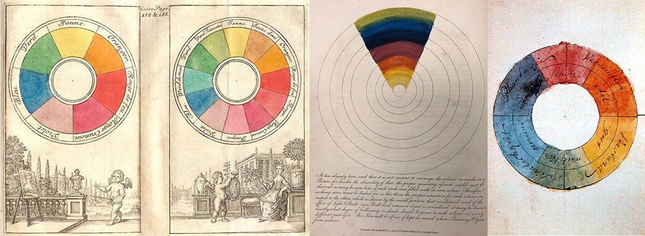
It wasn’t until Sir Isaac Newton (1642-1727) passed white light through a prism, splitting it into the spectrum of colours, then passed it back through another prism, returning it to white light, that concrete theories developed around colours. Newton showed that colours existed in a visible range between Red and Violet, and he described seven hues: Red, Orange, Yellow, Green, Blue, Indigo, and Violet. It wasn’t long after Newton’s Opticks (1704) was published that the first colour wheel was developed by Frenchman Claude Boutet in 1708, showing seven colours (Yellow, Orange, Fire Red, Crimson, Violet, Blue and Green) and suggesting mixing around the wheel to achieve colour harmony.
The three-colour system using the Primary hues of Yellow, Red and Blue was laid out in 1726 by German Jacob Le Blon, and by the beginning of the 19th Century, painters were well acquainted with using this and the Secondary hues of Orange, Violet and Green. In England, Mary Gartside (1755-1819) became the first woman in the Western world to publish a book on colour and discuss colour theory in it. She also classified colours in warm, cool, and light colours, as well as the need to harmonise tints with regard to painting. The colour wheel had become an important tool for navigating colour.
Some of the earliest colour wheels: Claude Boutet in France 1708, Mary Gartside in England 1808, and Goethe in Germany 1810.
Not everyone was thrilled by this. The German polymath Goethe rallied against such a cool analytical approach with colour being determined solely by light, stating that colour is grounded in human experience, as well as elements of light and darkness. Goethe was one of the first to systematically explore colour and colour theory, of how colours are perceived and how they interact with other colours. Unlike Newton, Goethe argued that colour needed darkness, and some colours were made with elements of darkness. JMW Turner (1775-1851) agreed with him, situating all colours between light and dark, just as the ancient Greeks had done.
While Newton was right about the colours formed by visible light, where varying frequencies of light come together to produce colours in a process called additive mixing (the process used by phone and video screens, and movies), Goethe was more correct when it came to mixing colours from paint. When you mix paints, the result is always darker through a process called subtractive mixing, as each addition subtracts wavelengths of light. To get light back into the mixture, we have to add white: “The addition of white is the addition of light,” said Vincent van Gogh.
Arranging colours in order of how active or passive they are allows us to see their placement in the picture plane, with warm hues advancing and cool hues receding relatively, and their corresponding emotional measure.
Aligning colours with human experience gained in popularity with the growth of abstract painting at the start of the 20th Century. Rather than placing hues on a colour wheel, Wassily Kandinsky (1866-1944) placed them between two opposing poles based on their energy, how active or passive they were. At one extreme was Yellow, the brightest, most energetic hue; at the other was Blue, the deepest, most contemplative hue. In the centre, just as in Aristotle’s time, was Green, being a combination of Yellow and Blue; though one can have a more active yellow-green or a more passive blue-green. Kandinsky found that assigning hues an emotional power allows painters to create works “which directly influence the soul”.
Of course, what we need from our palette is not only influenced by our own understanding of how colours work, but by what we are trying to achieve. Painters working in monochromes, such as Yves Klein (1928-1962) in Blue and Ad Reinhardt (1913-1967) in Blacks, are not going to have the palette of a portrait painter, as they have different paths and desires. A painter’s palette becomes more refined as they gain experience in their particular journey, so that the selection necessary at the start, which offers a broad mixing potential, develops into a personalised array that allows the painter’s singular vision to be seen.
Let’s take a look at a basic palette, based on Le Blon’s Trichromatic System, and then see how this can be adjusted to factor in not only the different hues available, but also the physical characteristics of paints themselves.
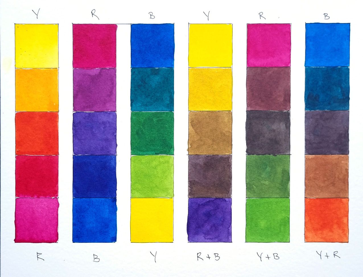
Mixing from three cool, single pigment Primary hues gives a broad range of possibilities, and forms a basis for additional colours when forming more specific colour choices.
The first question is: what are the three Primary colours? These change with the colours available at the time. In the 18th Century there were very few to choose from, with the first cool blue, Prussian Blue, discovered (by accident) in 1704. This colour was essential for Le Blon’s system, as the cool hues tend to provide the widest gamut of colours. Today we would use Phthalo Blue instead, as it is brighter so produces clearer colours. Alongside the Blue, a cool, lemon Yellow and a cool, bright Quinacridone Magenta in place of Le Blon’s Carmine, though that is also good.
We can see that these three cool Primary colours produce a broad range of hues. Mixed with each other, they circle the colour wheel with few obvious gaps. Combining a Primary with a Secondary (or Complimentary) colour made from the other two Primaries takes the mix across the colour wheel, through the dark centre, where the combination of all three Primary colours shows the effects of subtractive mixing.
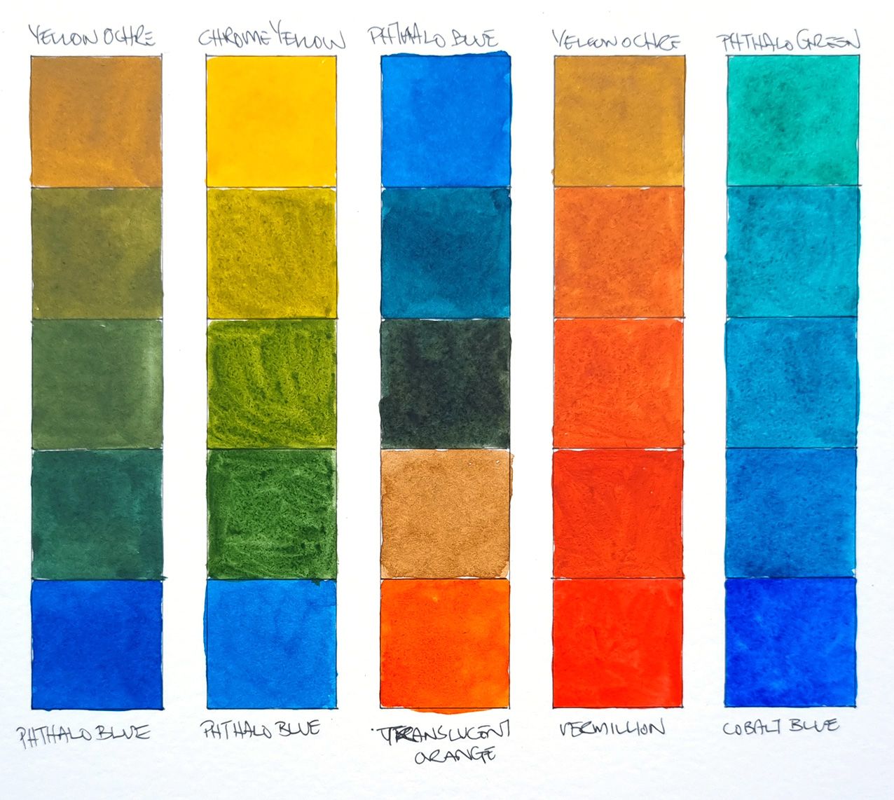
However there are plenty of Primary colours: there are around 20 different Yellow pigments available to artists today, and any of these can replace Lemon Yellow to give you a completely different palette. See what happens when we swap it out for an earthy Yellow Ochre or a warm Chromium Yellow Hue and mix it with the Phthalo Blue. No longer do we have bright leaf Greens, instead the Green shades are muted, softer, not so “loud”. These Yellows may suit a landscape painter better than the original line-up, or a painter wanting quieter tones.
Changing out the Yellow for Yellow Ochre or a Chrome Yellow (left) softens the range of available Green tones, while using a single pigment Orange rather than a mix (middle) preserves brilliance. The limited colour choices of 200 years ago gave way to a flood of new colours in the latter half of the 19th Century (right).
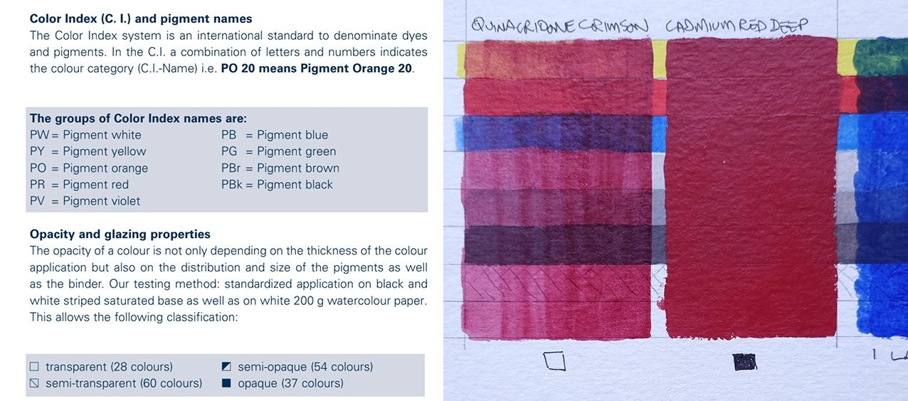
Single pigment colours make the cleanest mixtures. You can find the pigment composition of your paint by looking for the Colour Index: PY followed by a number for Yellow, PO for Orange, PR for Red, and so forth. For instance, Phthalo Blue is made from PB15:3. Colours made from multiple pigments do not mix so cleanly, and combining more than four pigments almost certainly results in mud. When we replace the mixed Orange in the original trichromatic system with a single pigment Orange (PO71 often called Translucent Orange or Poppy Red), the increased brilliance is quite apparent.
Increased brilliance was once shunned. Before the Industrial Revolution ushered in the invention of colours in the middle of the 19th Century, painters had few pigments to choose from, so relied heavily on mixing to create particular hues. They didn’t have access to the colours that we do, such as the wonderful range of Quinacridone Reds (since 1980s), so their palettes were very different from ours. Many colours were eye-wateringly expensive or hard to get (art stores would become a thing after 1850). We can see a transition from Yellow to Red that is very different to our original palette when we use a traditional Yellow Ochre and Vermillion, and though still beautiful it does not possess the range of hues of the modern palette.
The new colours developed in the 19th Century provoked a revolution. Cadmium, Cobalt and Chromium colours were discovered, along with “lake” pigments. Brighter, cheaper and more readily available, painters eagerly took them up, with a group called Impressionists often using them straight from the tube (invented in 1849), unmixed, in a determined show of Modernity. This grew into such brilliant abandon that Henri Matisse and his “Fauves” were called wild beasts!
Many modern pigments are bright, and sometimes that still puts painters off. Phthalo Green is one of these, a bright, glowing emerald that can’t be recreated through any mixture. Brilliant hues are easily tamed though, with their brilliance maintaining a clean result in mixing. Phthalo Green settles into a wide range of tones when mixed with various Yellows to create a broad range of Greens, Blue for turquoise tones, or Reds for silky Blacks and Greys.
The opacity or transparency of a colour is usually indicated by a square on the tube or colour chart, allowing you to choose colours that cover or glaze.
An important consideration in selecting colours is how translucent or opaque they are. This is a characteristic of the pigment (sometimes the binder, as in gouache), which may resemble a slither of coloured glass or a ball of metal, depending on the source material. Translucent or transparent colours are used for glazing, as they let light through them, while opaque colours are used for covering or scumbling (dry brushing). Translucent colours create cleaner mixtures than opaque colours, so including one or more in a mix helps preserve brilliance.
Understanding the inter-relationships of colours – the difference that substituting one Yellow for another, or a warmer Blue for a cooler one, for instance – will begin to shape your palette to your personality. Searching out single pigment colours over premixed hues will improve mixing results, colour harmony and save you money. Soon your colour choices will not only be dictated by the desired result, but the results will be entirely coloured by your choices.
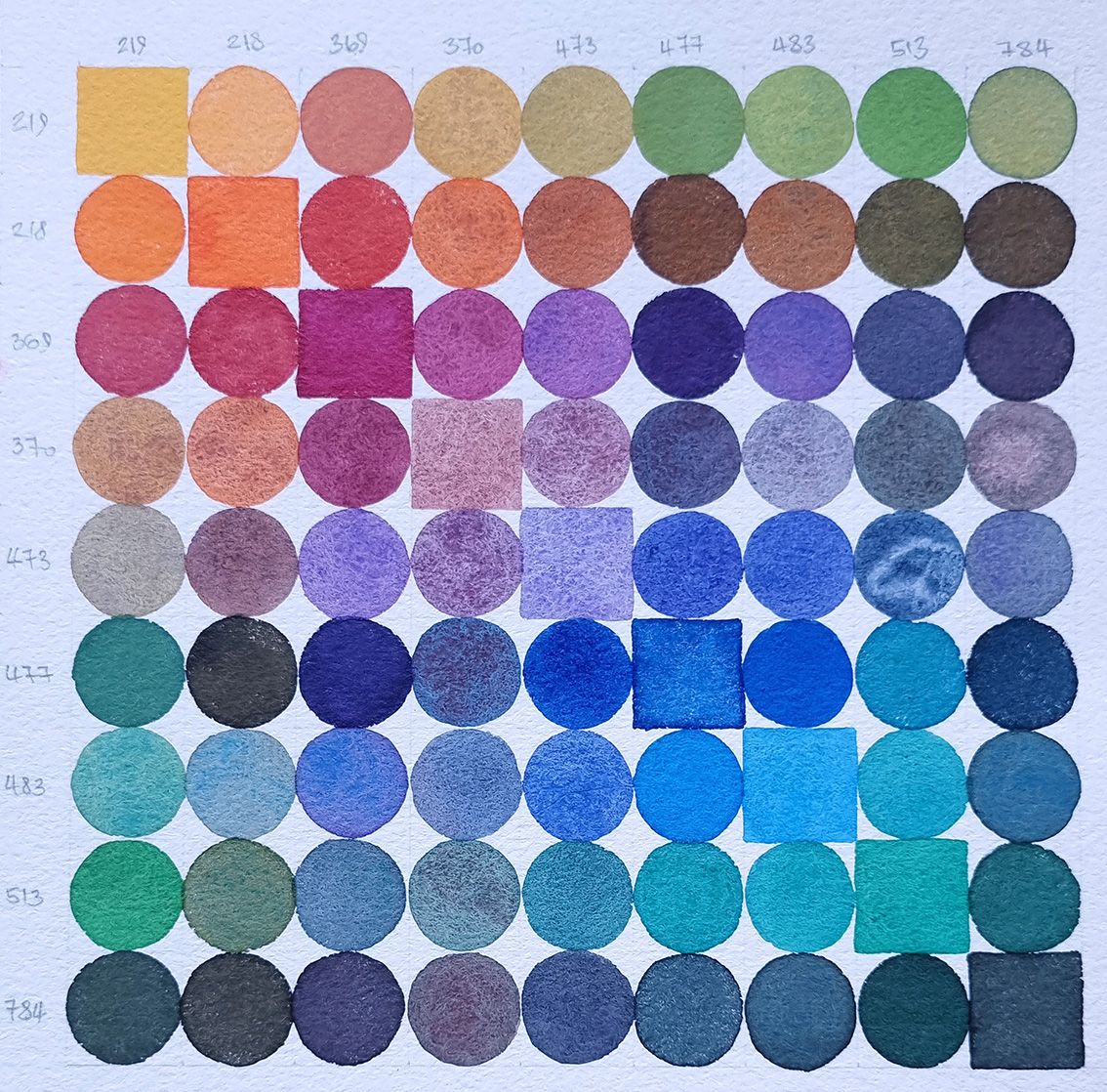
Two-colour mixing examples for the Horadam Ultimate Mixing Set, a collaboration between our very own Evan Woodruffe and Schmincke to showcase the possibilities of less ordinary colours.
We live in a time of abundant colour. No painter before has had so many colours so readily available, and at such relatively affordable prices. We may think a genuine Cobalt Blue is expensive, yet in the 16th Century an ounce of finest Ultramarine pigment cost a month’s salary. Thankfully, Ultramarine was synthesized in 1826, making it much more affordable! So grab a colour chart, try some mixtures (and record them!), and dream of colour.
You can read more about pigments on our blog:
https://www.gordonharris.co.nz/blog/126-why-do-artist-quality-paints-cost-more-
https://www.gordonharris.co.nz/blog/65-colour-in-the-21st-century-artists-have-never-had-it-so-good-
https://www.gordonharris.co.nz/blog/62-green-with-envy
https://www.gordonharris.co.nz/blog/67-here-comes-the-sun


